Brand Identity and Packaging Design
for a Korean Skincare Brand
CASE STUDY
THE CHALLENGE
Designing the brand identity and packaging for a Korean skincare brand highlighting its natural ingredients while setting it apart in a market saturated with competitors that lately lean towards ultra-minimalistic and neutral color palettes.
THE OUTCOME
A brand identity and packaging enriched with vibrant colors and illustrated patterns that encapsulate the essence of the brand’s natural ingredients.
THE SCOPE
- Art and Creative Direction
- Naming
- Brand Strategy
- Brand Identity Design
- Illustration
- Pattern Design
- Packaging Design
- Social Media Templates
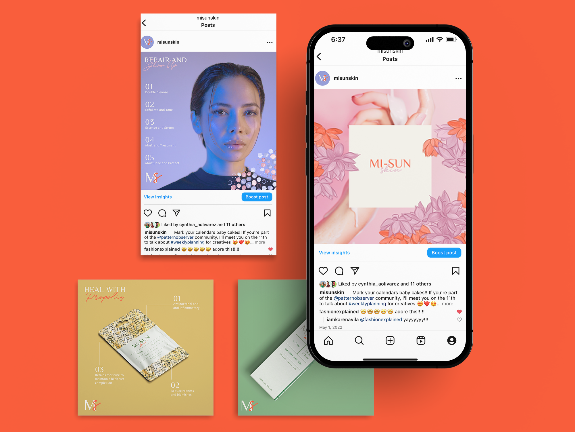
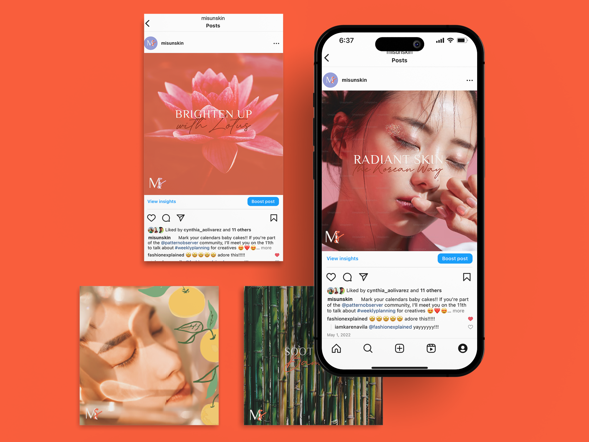
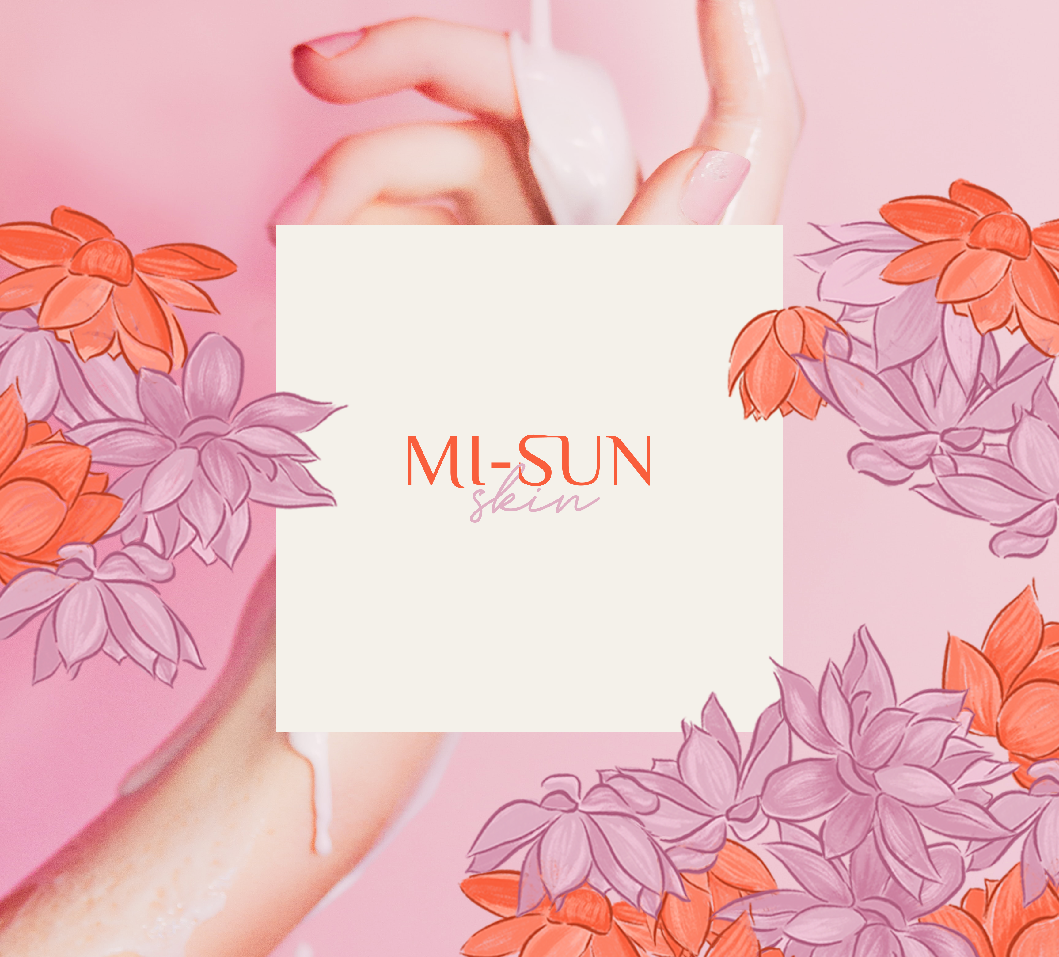
This is Mi-Sun Skin
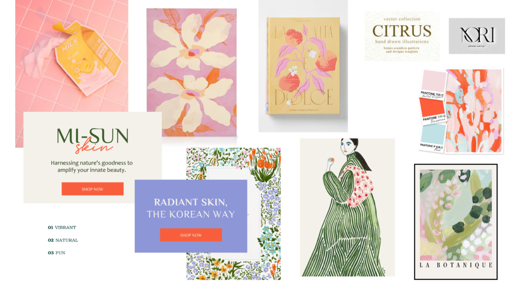
Amidst a sea of emerging skincare brands with shockingly similar branding and packaging styles – aiming for neutrals and type-only branding, I saw an opportunity for Mi-Sun Skin to differentiate itself through the use of vivid colors and enchanting illustrations representing its natural ingredients.
In my exploration of Korean names, I stumbled upon Mi-Sun, which translates to beauty and goodness. This name beautifully captures the essence of the brand: harnessing nature’s goodness to amplify your innate beauty.
Mi-Sun Skin
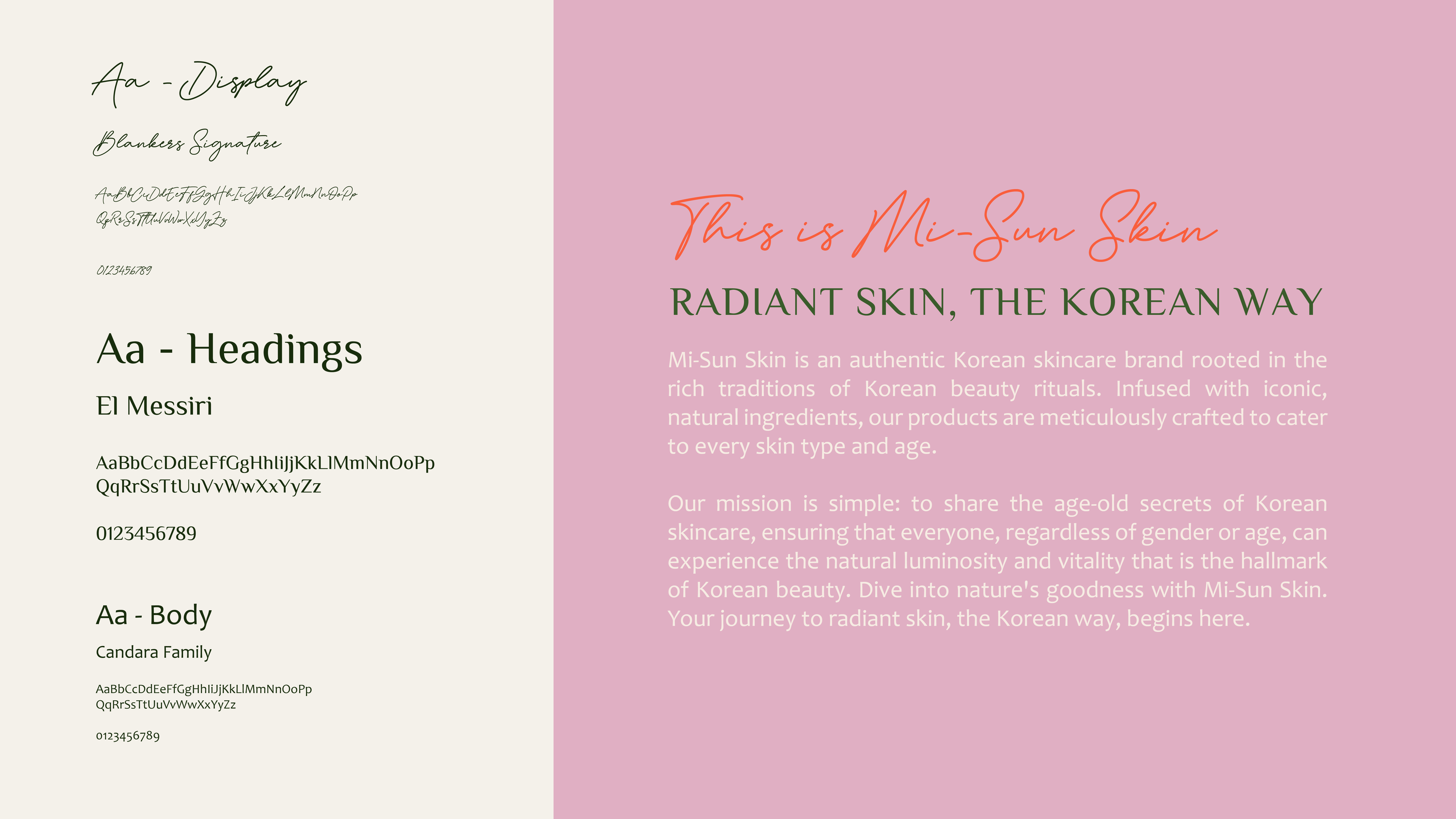
Mi-Sun Skin is an authentic Korean skincare brand rooted in the rich traditions of Korean beauty rituals. Infused with iconic, natural ingredients, our products are meticulously crafted to cater to every skin type and age.
Our mission is simple: to share the age-old secrets of Korean skincare, ensuring that everyone, regardless of gender or age, can experience the natural luminosity and vitality that is the hallmark of Korean beauty. Dive into nature’s embrace with Mi-Sun Skin. Your journey to radiant skin, the Korean way, begins here.
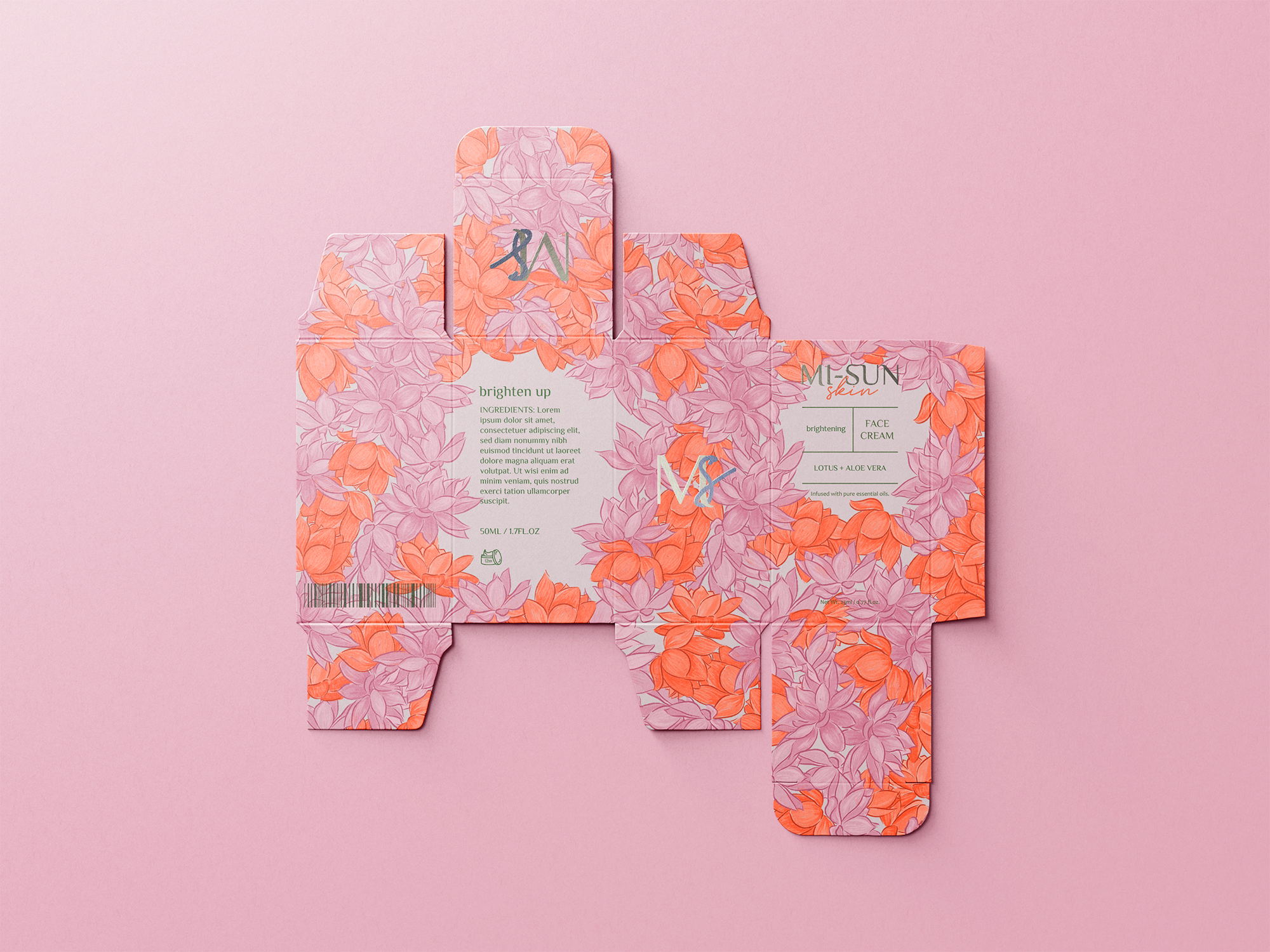
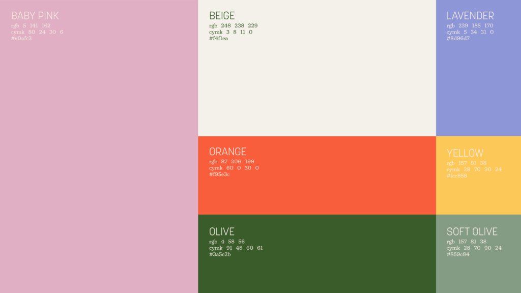
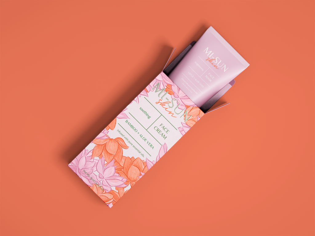
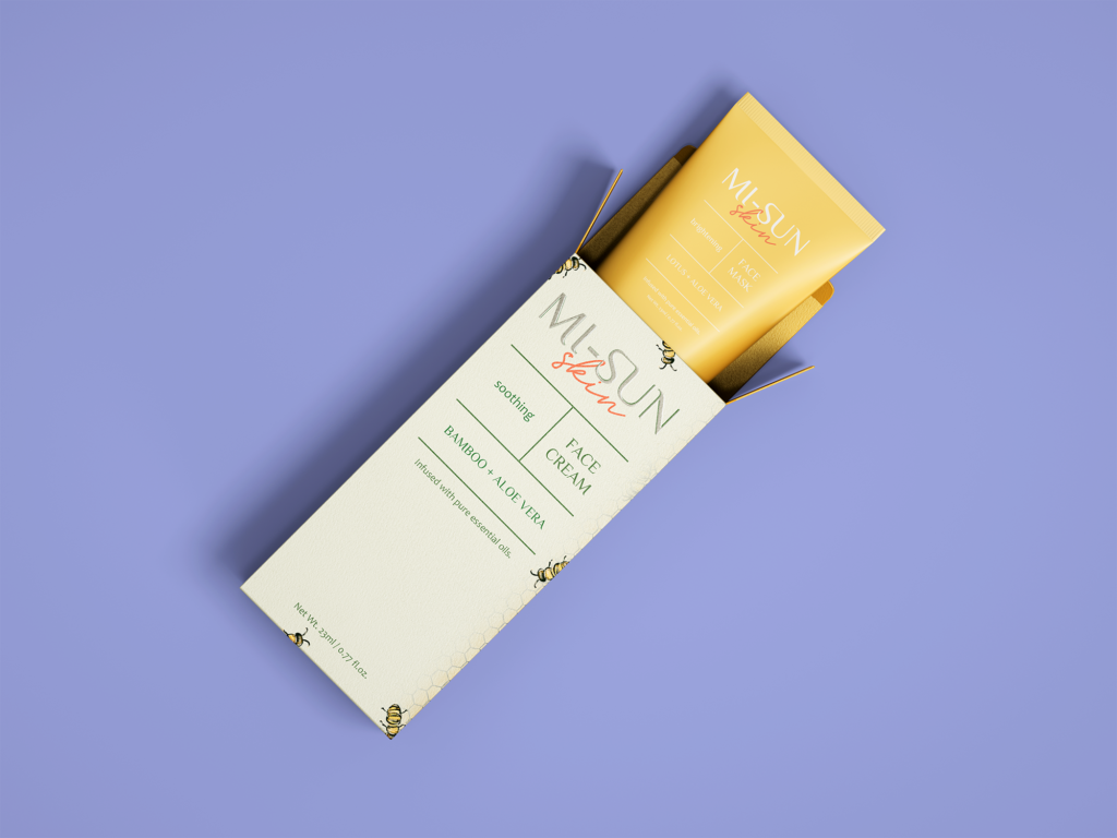
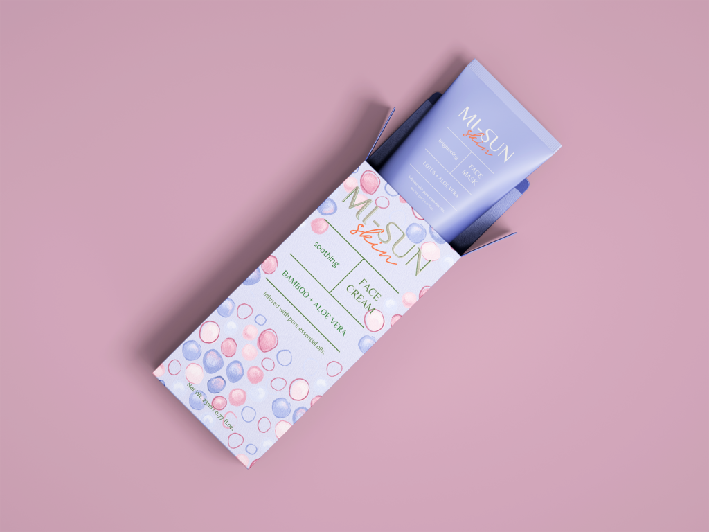
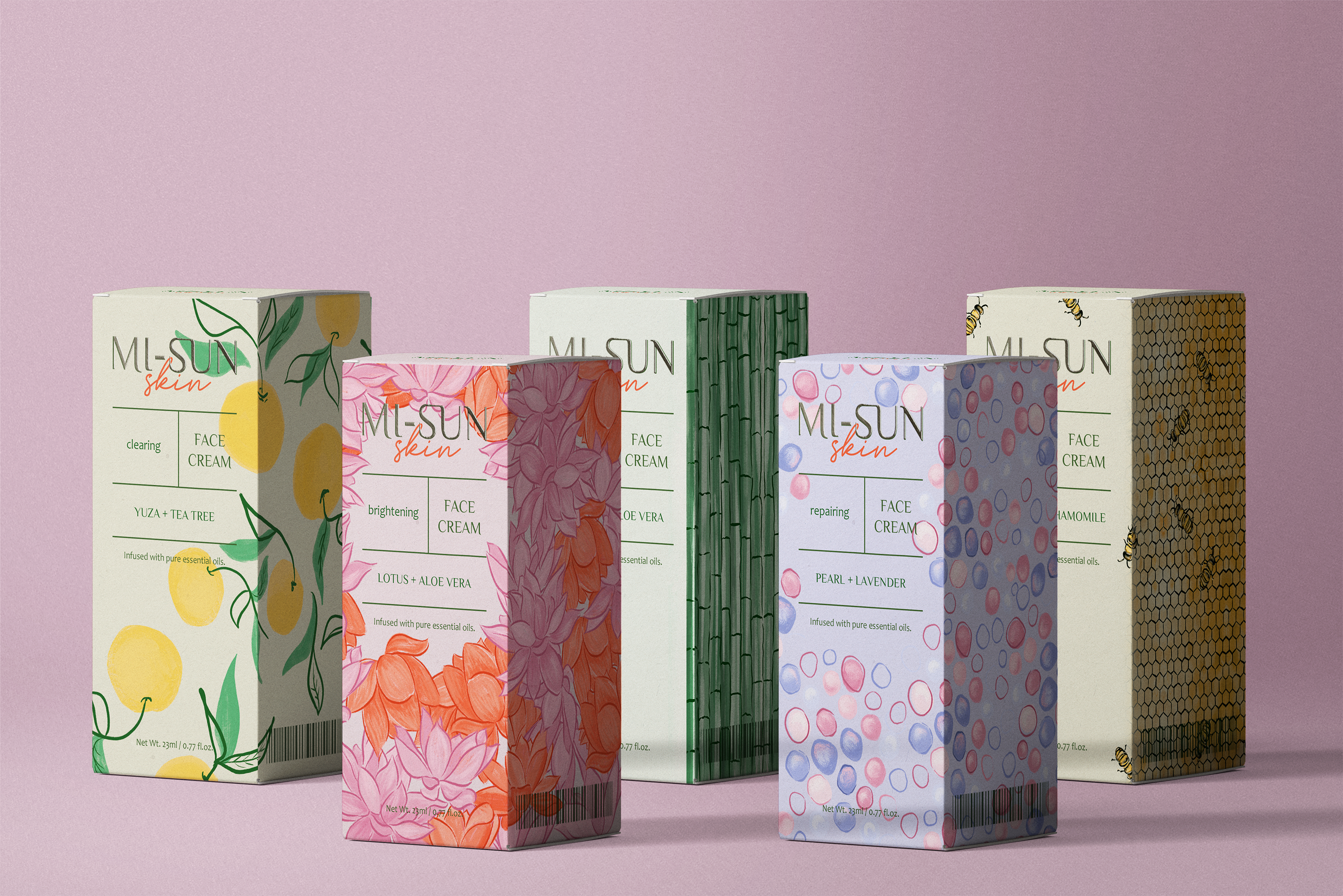
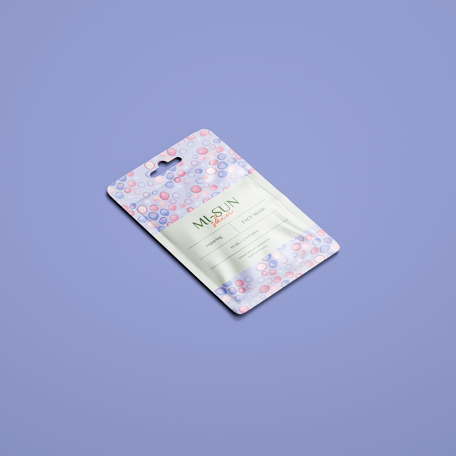
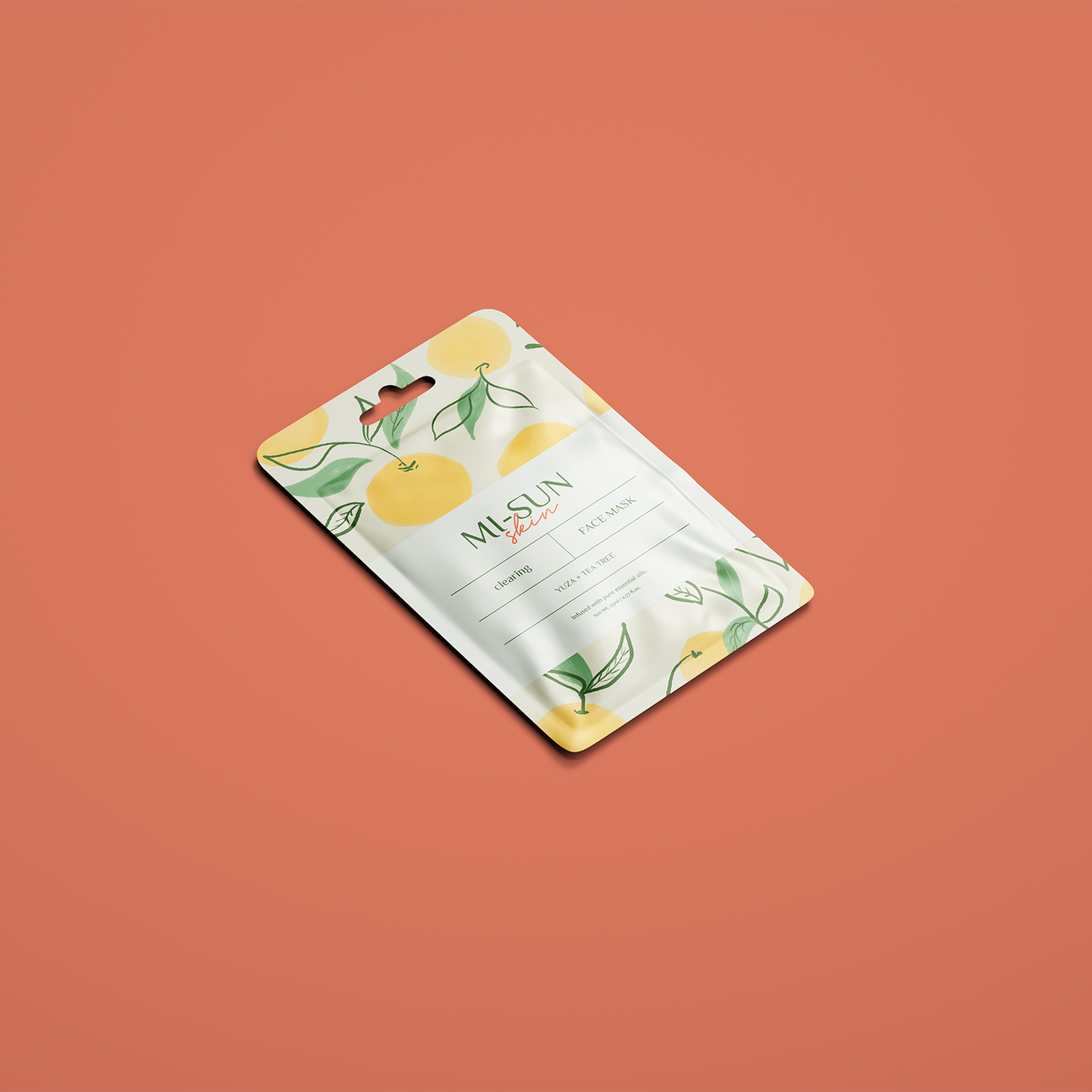
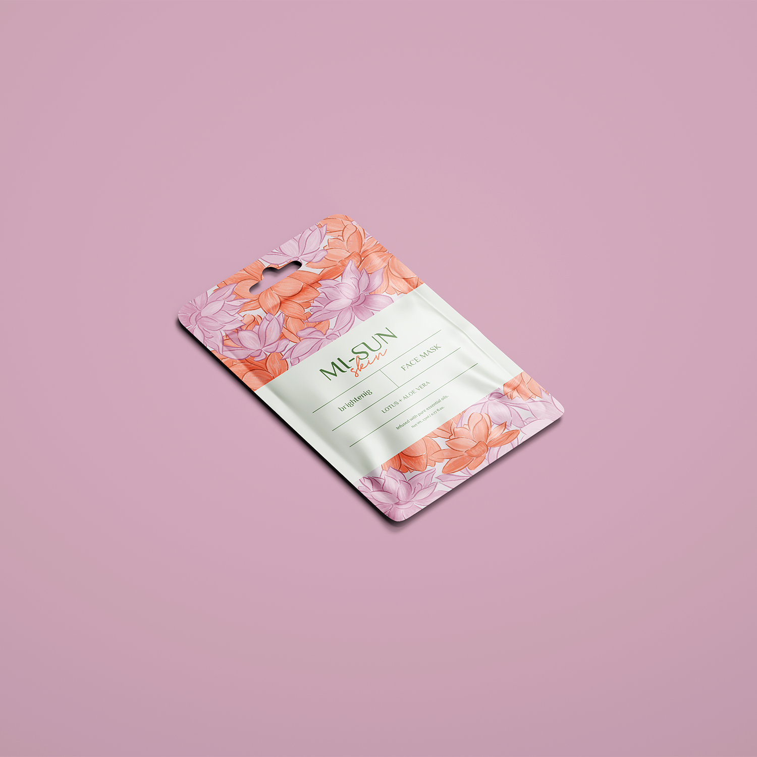
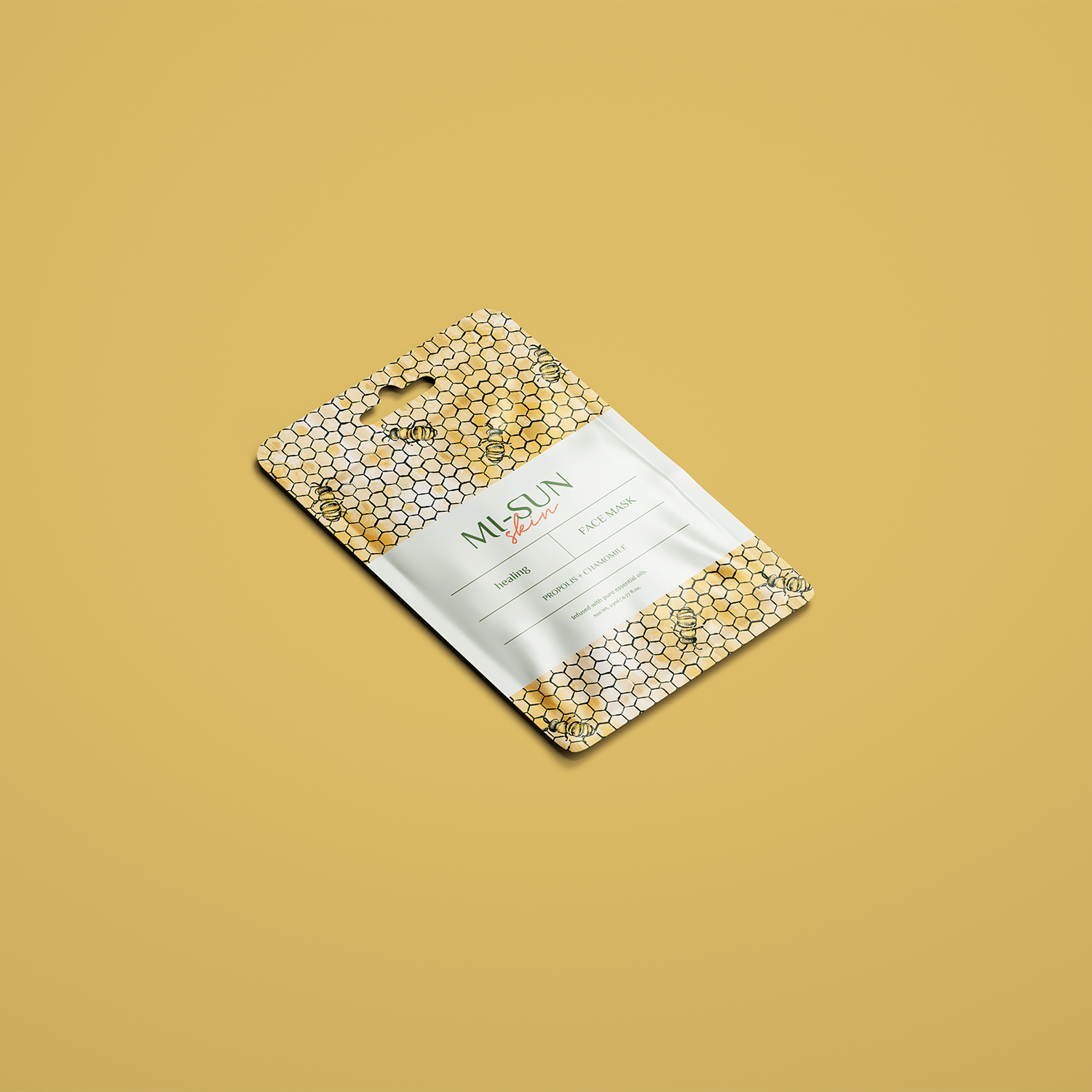
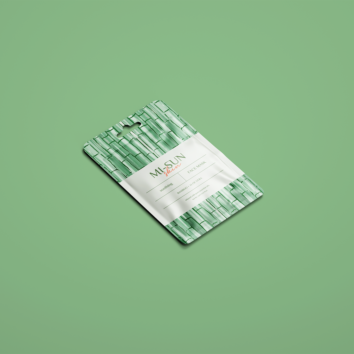
The brand’s colors take inspiration from the brand’s natural ingredients.
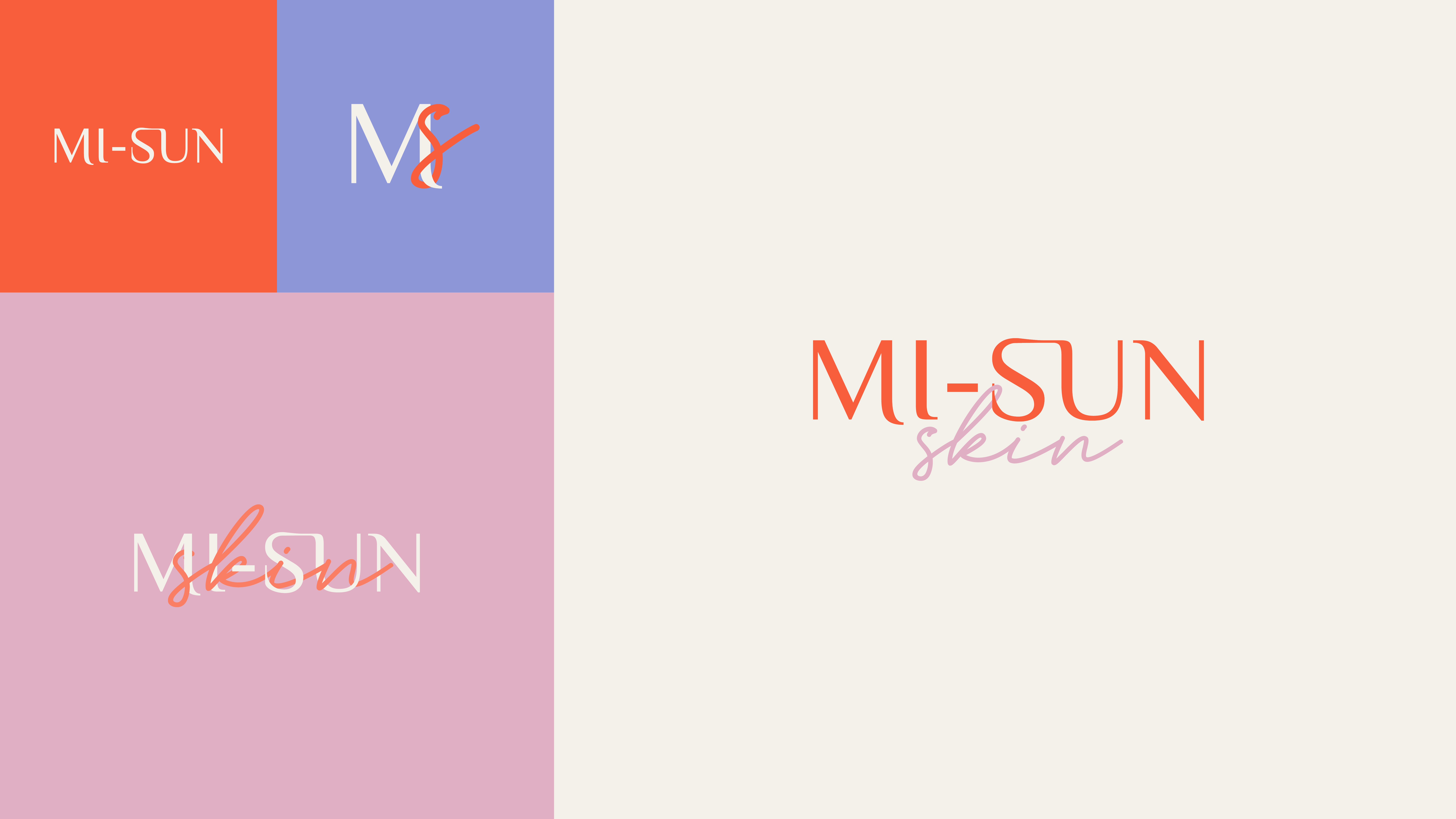
The logo is typographic in nature. For the primary name, MI-SUN, I employed the headings font, while using the display font for the word skin. I subtly adjusted the type to allow the two words to intertwine seamlessly.
For the patterns, I crafted playful and free-form illustrations using Procreate, employing brushes that mimic the appearance of gouache. These illustrations were later refined in Photoshop.
Each pattern represents a key natural ingredient of each product line, such as Lotus, Pearl, Yuza, Bamboo, and Propolis.
Finally, for the social media templates I focused on 3 main content pillars to create the branded templates:
Radiant skin tips
Products
UGC or influencers’ content