UI and UX Design for BANOBAGI
CASE STUDY
THE CHALLENGE
Redesigning the website for a Korean beauty clinic with diverse services was challenging due to its cluttered layout and lack of a session booking process.
THE OUTCOME
I led this project during my work as Creative Director at ONE11 Creative Agency. I began by establishing the website’s art direction and creating its sitemap and information architecture.
Followed by directing the wireframing, UI and UX design, as well as collaborating with the actual design.
THE SCOPE
- Creative Direction
- UI and UX Design
- Site mapping
- Wireframing
- Prototyping
Introducing BANOBAGI
Banobagi is a renowned Korean Beauty Clinic that has successfully expanded its franchise to the UAE. They offer an extensive range of services, including exclusive Korean treatments, dermatology, facials, nutrition, laser hair removal, fillers, and more. Their primary objective is to introduce the unparalleled Korean beauty expertise to the GCC region.
Their former website was not just outdated but also lacked user-friendliness. It presented challenges for users in terms of navigation and understanding the services.
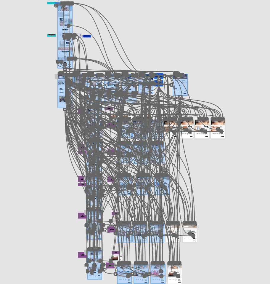
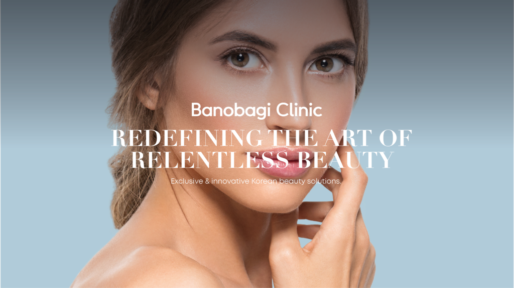
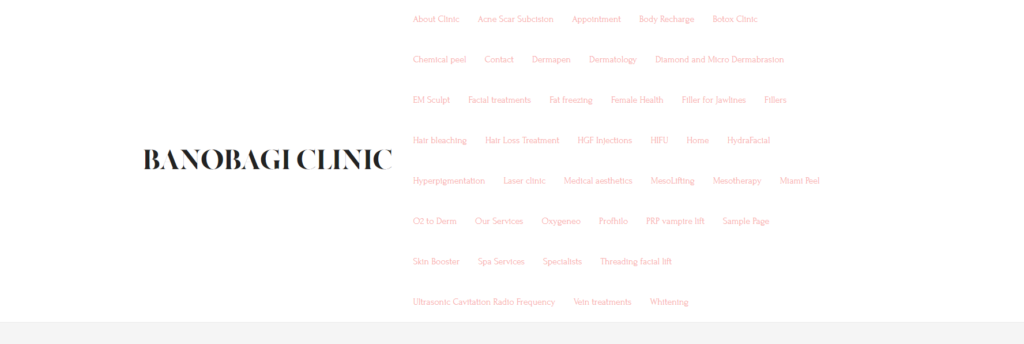
The Previous Website
TOP MENU
HOME PAGE
SERVICE PAGE
The Client’s Objectives
The most significant challenge lay in crafting an organized catalog of their services while ensuring the user interface (UI) and user experience (UX) remained top-notch and aesthetically appealing.
While the client would use a separate software for the appointment booking, they need a streamlined process to get to that page.
With that in mind, the MAIN objective WAS:
Clear and easy to navigate service catalog, help users understand the different offers, and allowing both returning and new clients to effortlessly book appointments through the website, eliminating the need to call for reservations.
Designing the Website
THE CREATIVE + ART DIRECTION
Following an extensive discussion with the client, which provided me with a thorough grasp of the brand, I began the foremost task: setting the creative direction for the website.
This inspired the concept:
NATURAL GLOW
Next, I proceeded to establish the art direction, striving to strike a balance among cleanness and beauty without looking stock-ish. Below, you’ll find the style tile showcasing the photography style, typography layout, color palette, and button design.
THE SITE MAP + INFORMATION ARCHITECTURE
Having reviewed the content and documents supplied by the client, I moved on to developing the sitemap and information architecture for the new website, aiming for a flawless user experience.
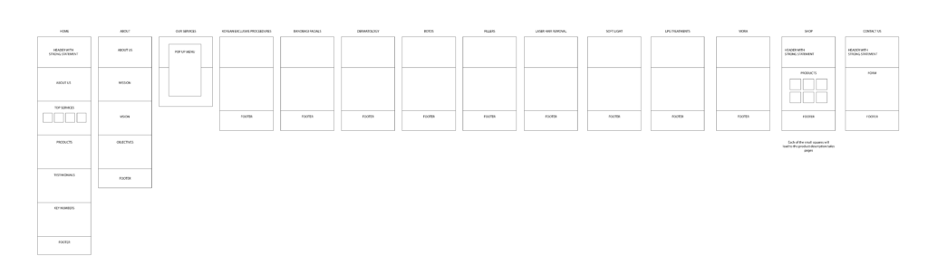
THE WIREFRAME
I aspired to design a dynamic layout with well-defined service categories.
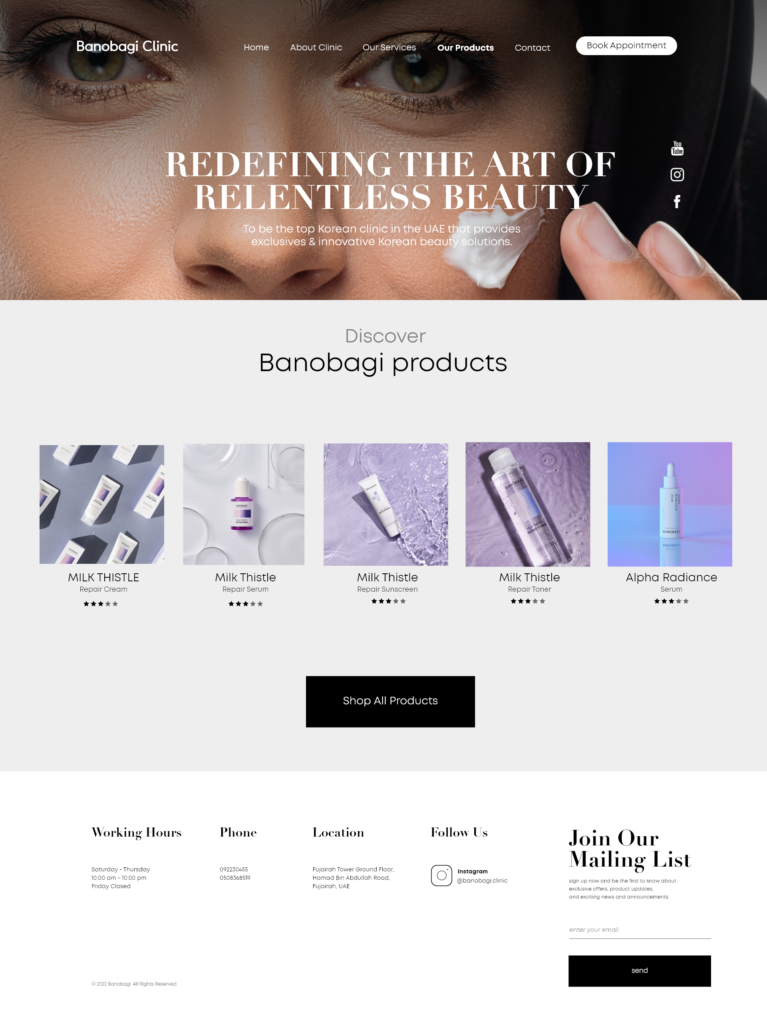
THE WEBSITE
We utilized Adobe XD for both the design and the prototype. This facilitated seamless collaboration between the designers and me, while also allowing the client to provide feedback and suggest changes. Below, you can catch a preview of the final website, showcasing a harmonious blend of modernity and simplicity.
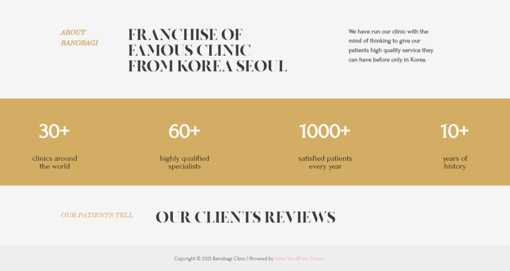
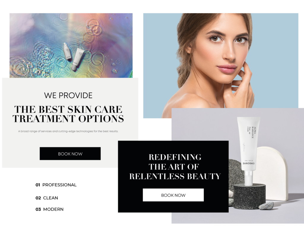
HOME PAGE
ABOUT PAGE
POP-UP MENU
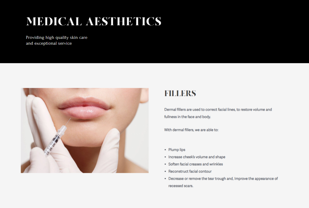
PRODUCTS PAGE
CONTACT PAGE

THE PROTOTYPE