Mi-Sun Skin
Brand Identity and Packaging
BRAND
AI IN THE PROCESS
ILLUSTRATION

SCOPE
Full Brand Development: naming, strategy, identity, illustration, patterns, collaterals. Personal project.
The Brief
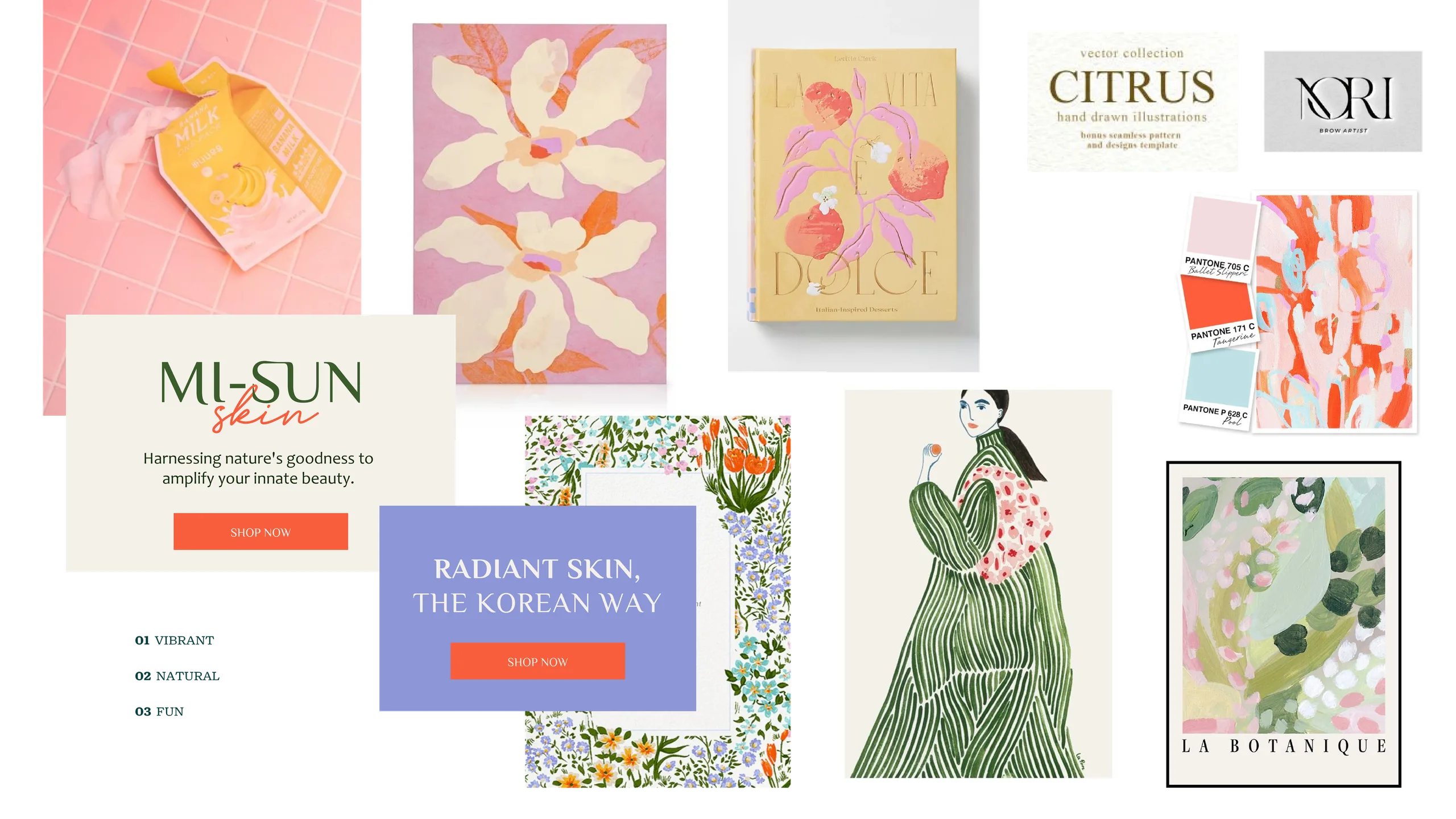
K-beauty branding has collapsed into sameness, neutral palettes, type-only logos, packaging you could swap between brands without anyone noticing. The challenge: build a Korean skincare brand that celebrates its natural ingredients loudly enough to stand out on a shelf.
The Idea
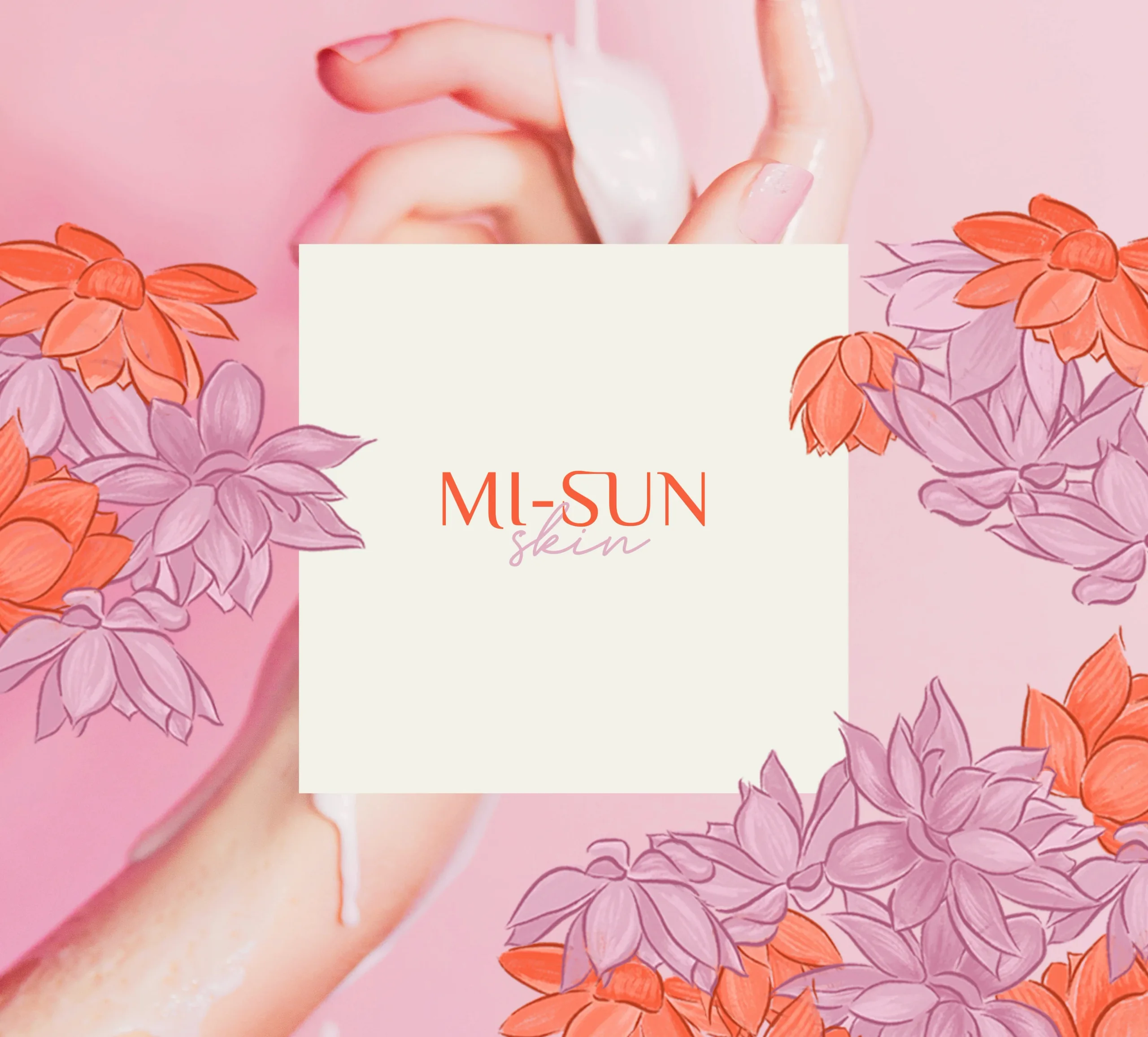
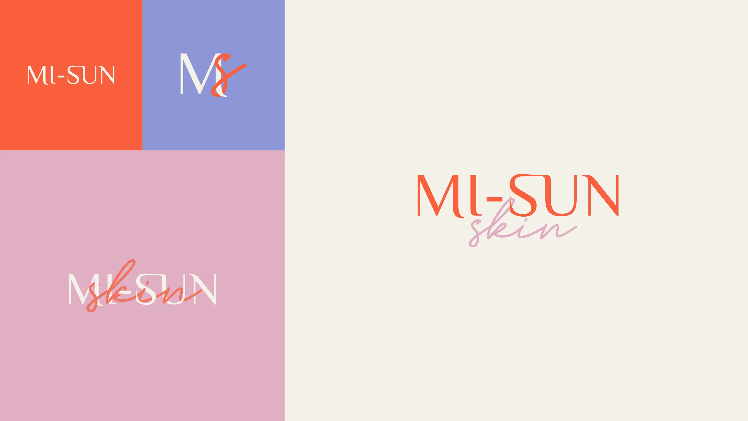
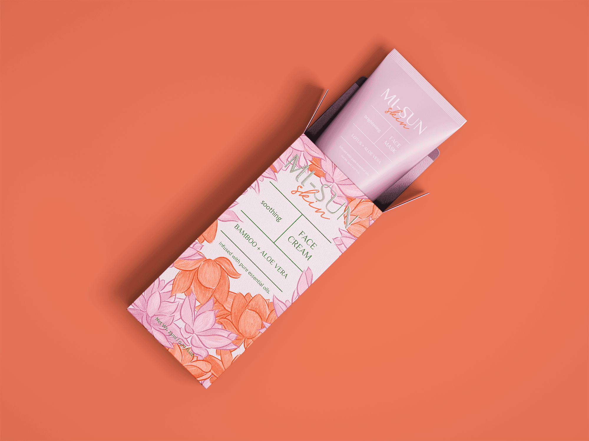
Mi-Sun, Korean for beauty and goodness, became a brand where every product line wears its hero ingredient as art: Lotus, Pearl, Yuza, Bamboo, and Propolis, each rendered as a playful gouache-style pattern. A typographic logo intertwines the two words; the palette comes straight from the ingredients themselves. Vivid where the category was beige.
The Craft




AI in the Process
Having created the brand in 2023, and now being 2026, I wanted to test a few AI tools for image and video generation. The first round came out promising, and with some rounds of changes, a draft of a showcase video was ready to go. The tools used were Claude with Higgsfield connector, and Kling 3.0 as the video generator.
The Outcome
A brand identity and packaging enriched with vibrant colors and illustrated patterns that encapsulate the essence of the brand's natural ingredients. Each pattern represents a key natural ingredient of each product line, such as Lotus, Pearl, Yuza, Bamboo, and Propolis.

